
Section Types
A section is one block of your storefront: a banner slideshow, a strip of products, a block of your own content and so on. This page lists the fields of each built-in type. You edit them in the section editor, under Appearance >> Themes; see Edit a section.
| Type | What it shows | Where it appears |
|---|---|---|
| Image Carousel | A slideshow of banner images | Home page |
| Product Carousel | A strip of products chosen by filters | Home page |
| Category Carousel | A strip of categories | Home page |
| Static Content | Your own HTML and CSS | Home page |
| Services Content | Short service promises, such as free shipping | Most pages, but not sign-in, cart, checkout, search results or account pages |
| Footer Links | Columns of links in the footer | Most pages, but not sign-in, cart or checkout pages |
Changes to fields, switching sections on or off and their order are held until you click Publish in the section editor. See Most changes wait until you publish.
Image Carousel
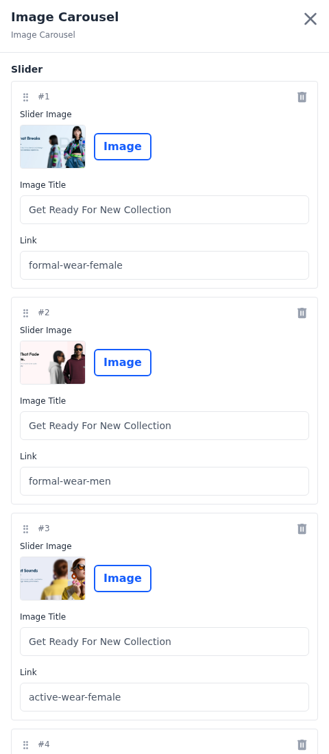
The banner slideshow at the top of your home page. Click Add Slider to add a slide. Each slide has these fields:
Slider Image: The banner itself. Click Image to upload a JPG, PNG, WebP or BMP image of up to 50 MB. It's saved in WebP format. A size of 1920 × 700 pixels suits the default theme.
Image Title: A short description of the image, used by screen readers and search engines. It isn't shown on the slide.
Link: Where a shopper who clicks the slide goes. Enter a path on your store, such as a category's URL key, or a full web address.
Slides are numbered in the order they play. Drag a slide by its handle to move it, or click the bin icon to remove it.
Product Carousel
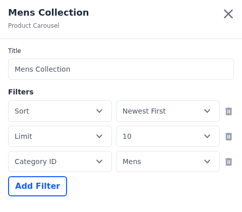
A titled strip of products, such as Mens Collection.
Title: The heading shown above the strip.
Filters: Which products appear, and in what order. Click Add Filter, choose a filter on the left and its value on the right. Remove a filter with the bin icon.
| Filter | What it does |
|---|---|
| Sort | The order of the products, using the sort options of your storefront, such as Newest First or Cheapest First |
| Limit | How many products the strip holds. The choices are the numbers in Products Per Page, in the Storefront section of Configure >> Catalog >> Products, or 12, 24, 36 and 48 when that setting is empty. |
| Category ID | Shows products from one category. Categories are listed by their full path, so two with the same name can be told apart. |
| Featured | Yes shows only featured products |
| New | Yes shows only products marked as new |
Once every filter is in use, Add Filter is greyed out. Hover over it to see "Every available filter has already been added."
Category Carousel
A strip of categories, so shoppers can jump straight into a department.
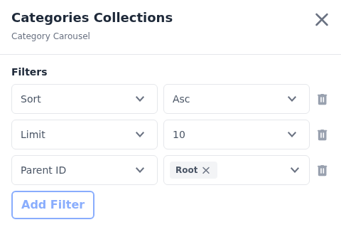
Filters: Which categories appear:
- Limit: how many categories the strip holds, from the same choices as the Product Carousel. Without a limit, it shows 10.
- Parent ID: shows the subcategories of one or more categories. Choose Root to show your top-level categories.
The panel also offers a Sort filter. Don't rely on it to order the categories; check the order in the preview.
Static Content
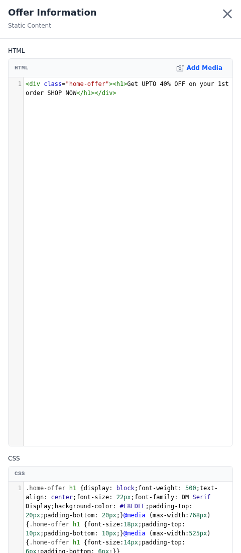
A block of your own content, such as an offer banner or a promotional band between two carousels.
HTML: The block's markup. Click Add Media to upload an image, or an MP4, WebM or OGG video, of up to 50 MB. It's added to the markup where your cursor is. Images are saved in WebP format.
CSS: The styles for the block.
Keep your styles to your block
The CSS applies to the whole page, not only to this block. Give your markup its own class and start every rule with it, for example .home-offer h1 { ... }. Otherwise the styles change other parts of the storefront too.
Scripts, frames and forms are removed from the HTML when it's saved, so a block that relies on them won't work.
Services Content
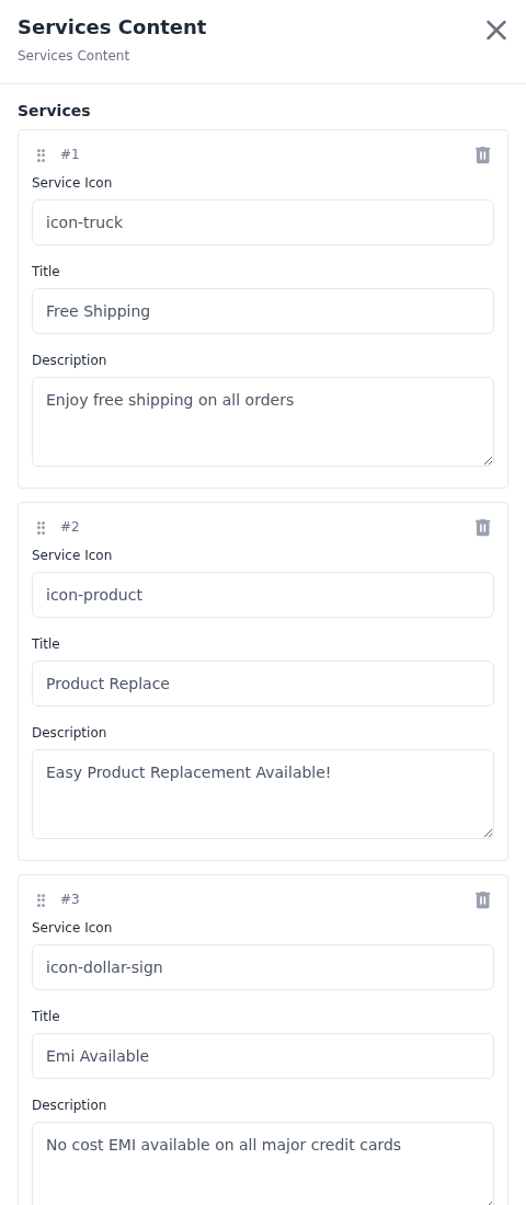
The service promises shown on most storefront pages, such as free shipping or easy returns. Click Add Services to add a promise. Each one has these fields:
Service Icon: The name of the icon shown beside the promise, typed as text, such as icon-truck for delivery.
Title: The promise itself, in a few words.
Description: One line of supporting detail.
Footer Links
The columns of links in your storefront footer. A channel has one Footer Links section. It's pinned to the bottom of the page, so it can't be moved or duplicated.
Add a footer link
- Open the Footer Links section.
- Under Columns, click Add Column to start a new column, or use an existing one.
- In the column, click Add Link.
- Enter the link's Title, the words a shopper reads.
- Enter its URL, such as
page/about-usfor a CMS page. - Click Publish in the section editor.
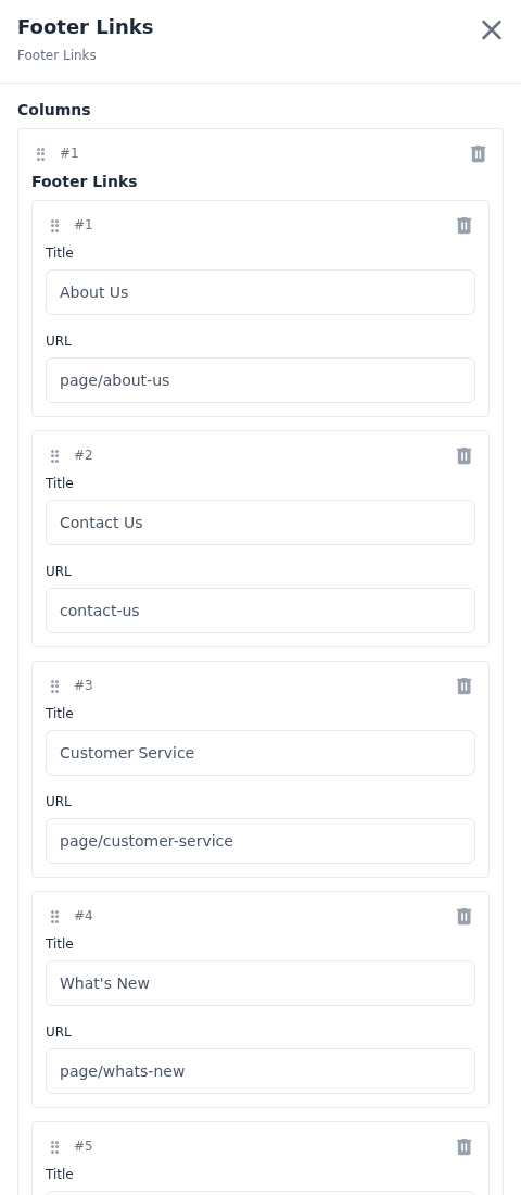
Drag columns and links by their handles to change the order. A link needs a Title to appear in the footer. Links left without a title and URL are dropped when the section is saved, and so are empty columns. The default theme shows as many columns as you add, but a theme you install may limit the number.
Types added by a theme
The default theme offers the six types above. A theme you install can add types of its own, such as a testimonial slider or a brand strip, or offer only some of the built-in types. Its types appear under Type when you create a section for that theme. They have their own fields, and you edit and publish them like the built-in types. If a type you expect is missing, check that you're customizing the theme it belongs to.